Brown Arts Initiative
The Creative Ivy
The arts are integral to the academic mission of Brown University—so vital, in fact, that “cultivating creative expression” is a key component of the University’s current strategic plan, Building on Distinction.
Known as the “Creative Ivy,” Brown is recognized for its rigorous fusion of arts practice and scholarship, and serves as an incubator for both traditional and experimental art and media. Its Open Curriculum fosters curiosity-driven investigation and invites participation from students of all disciplines and skill levels, as well as from faculty and scholars using the arts as a foundation for cross-cultural exploration and an agent of social change.
Our team was selected to brand this new initiative, drawing from examples given by the BAI and other outside inspiration. We received the President and Dean’s approval to break from the University-wide brand standards to promote the BAI’s innovative identity system. In addition to the initial system, a series of applications were developed in tandem with the launch of the BAI’s spring annual Arts & Environment Symposium.
Our Solution: Between Organization & Improvisation
The freedom to create (and express) is central to the ideals of art, and it is a founding principle of both the BAI and Brown University. Our communications strategy for the BAI hinges on this idea of freedom and the related ideas of movement, flexibility, interconnectedness, and versatility. As you might note, the BAI identity isn’t representational or figurative—in this instance, representational forms can limit the imagination rather than liberate it. Instead, we developed an identity that is abstract with open forms; forms that create meaning and feeling through context, juxtaposition, arrangement, improvisation, organization, disorganization or disruption.
The BAI identity is purposeful and perhaps better thought of as a matrix of meaning rather than a static mark; a visual language rather than a logo; a dynamic system rather than a singular signifier.
While the BAI is an organization (an umbrella entity), it is also a collection of disparate departments and disciplines thriving both individually and in assembly with one another. Our brand strategy is motivated by this concept. The identity is based on the letters “B” “A” and “I” — or the words “Brown Arts Initiative.” By basing our forms on these initial letters/words, the visual language will always be grounded—mored to the meaning inherent in these important letters/words. These visual markers that make up the composition of letterforms are conceived in concert with one another, generating an ever-changing pattern of lyrical, linear forms. Depending on how these forms are color-coded determines whether the letters are recognized as discrete characters, or enjoyed as purely abstract. This creative tension between the known and unknown, between order and disorder, between centralization and decentralization is an essential aspect of the arts, and defines our visual identity system.


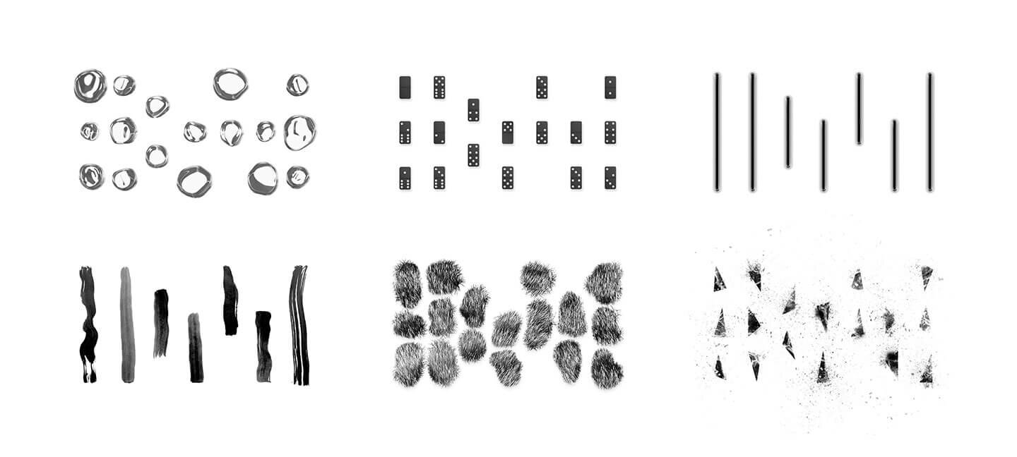
Exponential Possibilities. One of the most exciting aspects to the BAI’s identity is its ability to expand and take shape using a multitude of formal components. This exploratory openness is exactly at the core of the BAI’s mission; inviting creative ownership of the BAI brand to its collaborators. The basic premise is to be inspired by what surrounds you. Is it the spring raindrops or fall leaves; painterly brushstrokes or tufts from the Brown Bear mascot; a collection of emojis or a domino set? Is it the choreographed placement of dancers; or the lyrics to ‘C’est Si Bon’ by Eartha Kitt?
Anyone can create their own BAI mark by following the basic structure of the “i” lines as the blueprint-matrix to fill in the blank. It is an open invitation to the community, and an expressive way for our brand to evolve with the arts.
Yes/And. It is no coincidence that the individual “i” lines that make up the BAI identity reflect the structurally misalignment of the Granoff Center. These sectional opportunities allow each floor to interact with two conjoining levels, where students and artists are able to see into multiple spaces from a single vantage point. The architects visual representation reflects the BAI’s core mission to foster creative exchange. To further honor the BAI’s collaborative spirit, we took inspiration from the buildings creators and opened a metaphorical dialogue with the existence of our new brand identity—a design that reflected back to their original ideation.
Dynamic Movement. When developing the website we chose to feature the dynamic quality of the identity. Text and image floated in and around the matrix of lines. Shifts of color helped to highly key words of engagement. Color also became a useful tool to underscore various elements of the site.
Applying the Visual Identity. Once the branding was approved, we established a series of applications to help advance the prominent strengths of the identity. The poetry of the system was that it could live both beautifully in black and white, or take on a full spectrum of color.
Environmental Engagement. The banner designs fully embodied the principles of “form following function” with the logo design replacing the wind-slit cutouts themselves. This also allowed for the environment behind the banner to give visceral shape to the identity in provocative ways.


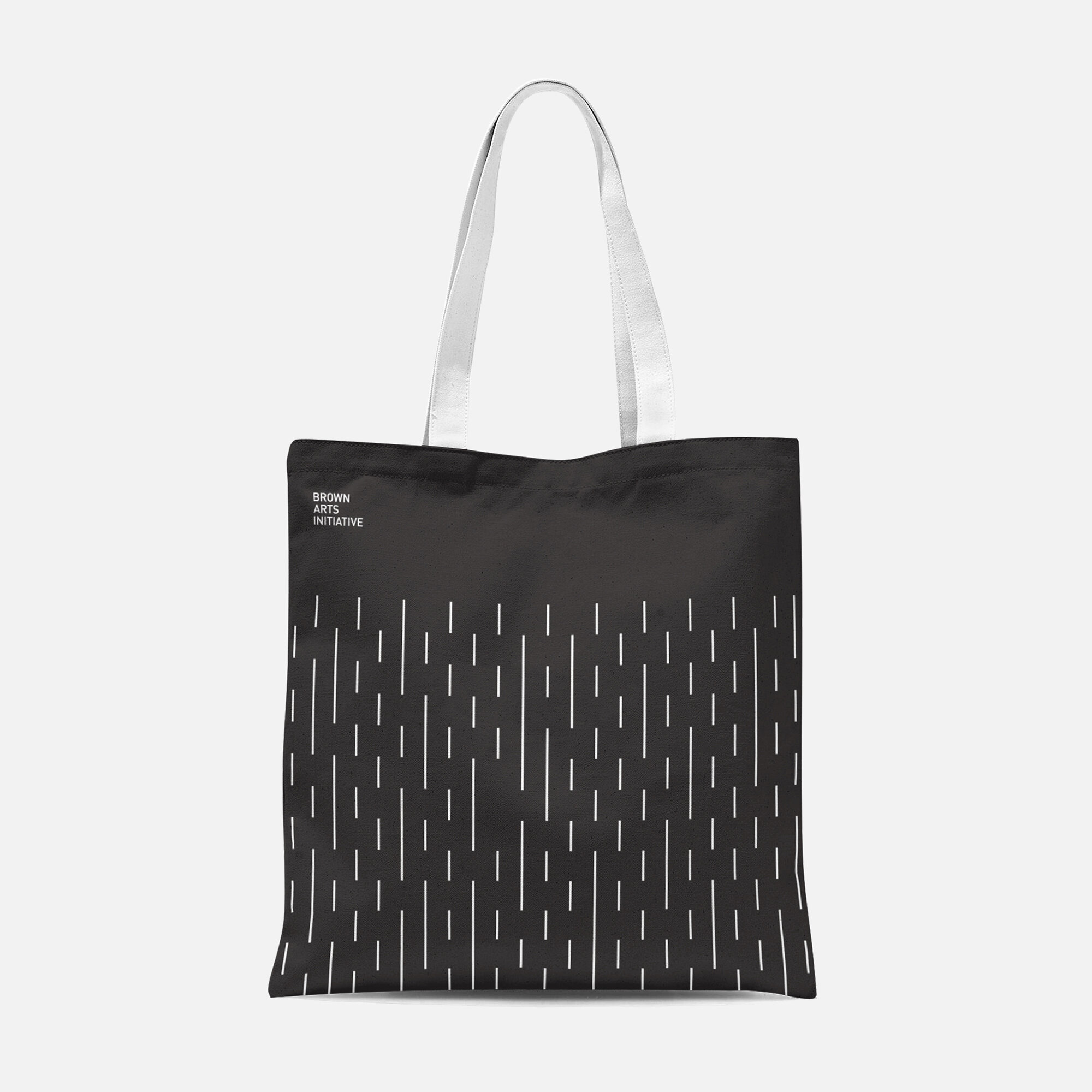
Clever and Expressive. A set of apparel and swag applications advertise the identity in both black and white and primary color palettes—expanding the usage of matrix renderings on objects with similar themes (e.g. Raindrops on an umbrella, liquid droplets on a water bottle).
Designed for Player Participation. As we bounced around different ideas, one that sparked joy was collaborating with Jenga—branding a BAI addition with its primary color scheme, and imprinting famous alumni artist quotes, as well as the BAI wordmark. This team-oriented game spoke to us in particular with its connections to the conceptual metaphor of construction and deconstruction.
There’s a (M)app for that. During our discovery phase we heard the BAI leadership talk about how art isn’t just housed at the Granoff Center, but that it can be found all around campus, Providence, and the world. We responded with a concept to develop a brochure and app called “The Creative Ivy - Campus Art Tours,” to help guide prospective families and visitors who might be curious to see Brown through the lens of an artist.
How It works. After downloading the app from the brochure (or app store), users could tap on the digital map or scan the artwork with the apps camera feature to load the artists description of the piece, footage of the making of the work, and/or the installation process on campus. You could also search by title, artist, or medium which would also be color coded on the map to help narrow down your search.
Show Stopper. One successfully example of using the identity matrix was how we applied that system to events and theater production imagery. Taking thematic cues from each production, we developed familiar imagery sets that were cleverly evocative of each show. Event posters and tickets leveraged the personalty of the event, while also showcasing the BAI brand.
Arts + Environment Symposium. When making the visual system for the symposium, we wanted to further expand the usage of the identity matrix. In doing so, we designed the event poster by replacing the lines with the guest speaker names. For keynote speaker nametags we used environmental imagery (leaves) that corresponded with the event branding. Iconography was also implemented around the environmental topics being examined at the symposium.
Vinyl window signage was displayed on the front of the Granoff Center. Color coding helped to highlight important event details.
Don’t Miss out. A seasonal program booklet was designed to showcase semester events: performing arts productions, galas, art openings, concerts, guest performances, speaker series, artist in residence feature stories, sponsorship highlights and more. Floating imagery nodded to an ‘undesigned’ aesthetic; while collectively meshing and dancing with the linework of the identity.
Arts District. With the announcement of a brand new performing arts center design to be built in front of the Granoff Center, the BAI influenced the branding components for the fully funded Ronald O. Perelman Arts District—an area that encompasses a section on campus where most of the arts events take place. Keeping in harmony with the BAI identity, the new Arts District logo utilizes the same line treatment, but in a refreshing and unexpected circular composition, speaking to the centralized nature of the district on campus. Wayfinding was branded as well, incorporating the primary color palette and line treatments established by the BAI identity.


