MIT Together
Reassuring students that they aren’t alone.
Massachusetts Institute of Technology is known worldwide for its excellence in research, education, and innovation. But that same intensity—and the culture that surrounds it—can take a toll on mental health. In response, MIT launched a campus-wide campaign to support students, faculty, and staff by promoting connection, awareness, and access to care.
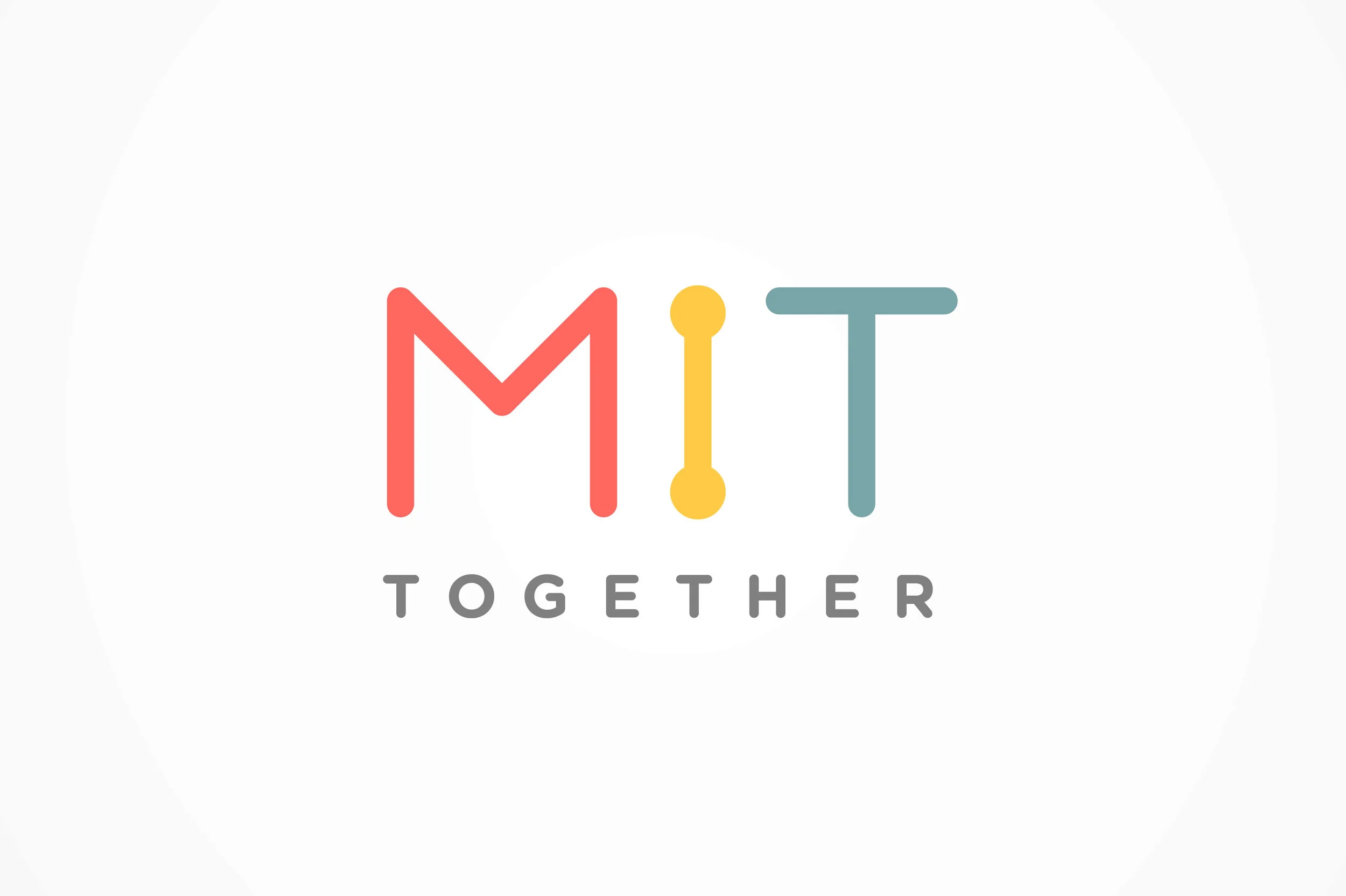
“A Connection” starts with two. As we developed the name, identity, and overall campaign messaging, we prioritized warmth and tonal neutrality—aiming to be supportive without sounding patronizing. Through discovery, we found that the most resonant approach for students was visual: a logotype that evoked connection through a simple dot-to-dot treatment. Using the symmetry of the three letters in “MIT,” the “i” became a natural focal point—anchoring thematic moments of interaction and meaning.
Colors carry emotion. We selected a soft, warm palette designed to feel approachable—familiar yet grounded, and serious without being severe. Each hue was intentionally placed along an emotional scale to reflect states of wellbeing: red signaling distress, yellow representing neutrality, and green conveying a sense of stability and wellness.


How the logo came together. We began with a simple grid, drawing the “MIT” letterforms with clarity and balance. The dots anchoring the “i” became key—symbolizing connection and forming the visual thread that tied the identity together.


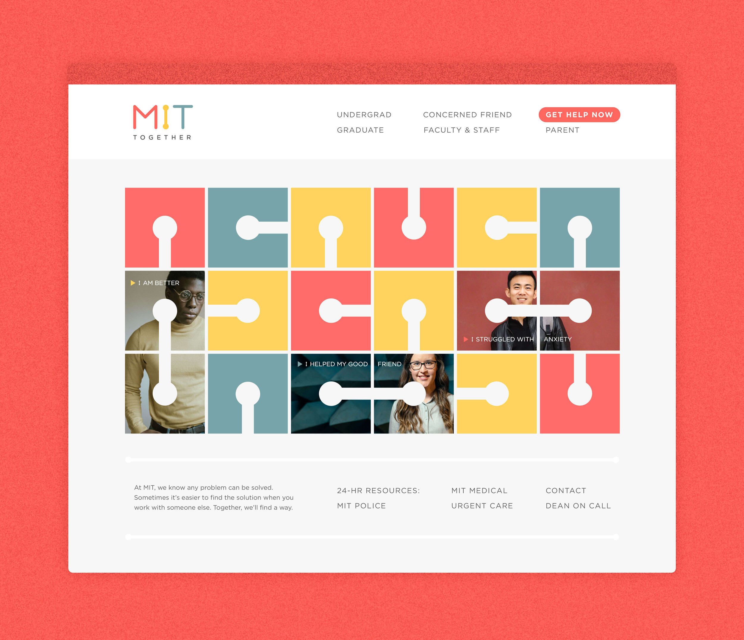
Welcoming & Informative. It was essential that the website feel easy to navigate and approachable. Our visual language evolved from simple dot-to-dot connections to include graphic “nodes” embedded within modular blocks—designed to shift and connect when rotated. This system extended into functional tools like the academic Stress Calendar, which used the same visual logic to highlight potential pressure points in a clear, infographic format.
Merging Visuals & Message. Visually, our system began with two simple, conjoining forms—reinforcing the idea that connection starts with just one other person. For someone struggling, that first point of contact can mean everything. The visual language expanded on that foundation, suggesting how relationships grow—through shared interests, clubs, sports, or music ensembles—forming networks of support across campus. Our messaging voice mirrored this tone: approachable, occasionally witty, even leaning into light “dad joke” humor. These gentle metaphors were designed to disarm, uplift, and offer small moments of relief—especially for the students who needed it most.
Infinite ways to engage. As part of our messaging strategy, we created a series of posters that reframed stress through clever, relatable analogies—drawing from math sets, physics principles, and other concepts familiar to MIT students. These metaphors helped normalize struggle and made space for humor and self-recognition. Each poster was paired with direct guidance: pointing students to specific campus resources aligned with the theme, offering tangible ways to find support.


Exponential Possibilities. The poster series was designed for flexibility—scaling from one to over a hundred, depending on the space. One of the most powerful expressions of the campaign’s theme of togetherness took place in MIT’s iconic Infinite Corridor. Lined side by side, the posters stretched the full 823 feet of this heavily trafficked hallway—creating a visual chain of connection that students walked through daily. It was a literal and symbolic pathway, reinforcing the message that support is always within reach—and grows with each step forward.
Applied Ideation. Building on our color-coded emotional scale, we proposed a mobile app to help students track and reflect on their daily mood. Using the identity system as an interactive spectrum, users could tap, slide, and log emotional highs and lows over time. Students had the option to keep their data private or opt in to share with a licensed therapist for additional support.
Designed with accessibility in mind, the app offered multiple pathways to care: from general wellness tips and campus resources to 24/7 support through a feature called “TIM” (MIT spelled backwards). A “Get Help Now” button provided immediate access to emergency support. The tool also empowered peers—offering cues to better understand and reach out to friends who might be struggling, reinforcing the campaign’s core message: connection starts with awareness.
Cards to Connect. As a tangible extension of the campaign, we created a series of clever business cards for faculty and staff to share with students. Each card featured a witty, approachable message and visual on one side, with space for personalized contact information on the other. These small gestures served as meaningful prompts—offering connection in moments that might otherwise go unspoken. Designed to be shared easily and without pressure, the cards helped normalize asking for support and reinforced the idea that connection can begin with something as simple as handing someone a note.
In or Out. To support peer-to-peer engagement at the dorm level, we designed a set of door hangers for resident advisors to use at the campaign’s launch. These simple, visible tools helped RAs initiate low-pressure check-ins with students on their floor—offering an easy way to signal openness, availability, or a need for space. The hangers became quiet conversation starters, reinforcing the campaign’s message that connection doesn’t always require words.
One is Never Enough. As with every branding process, we explored a range of visual directions before arriving at the final mark. These logo concepts represent the top three contenders during the selection phase.
The first concept built on the “i” in MIT—proposing that language itself could act as the connecting thread. It emphasized conversation as the visual and thematic link.
The second concept layered the letterforms of “MIT” through center alignment, visually merging them into a single unit. In a beautiful and unexpected discovery, the overlapping shapes subtly revealed a more prominent “T”—a fitting nod to Together emerging from within.


