The Clinic
A platform defining the future of digital health.
The Clinic is a joint venture between the Cleveland Clinic and Amwell with a mission to help patients, employers, and providers navigate the seemingly confusing healthcare system, aligning them with world-class clinical expertise through innovative digital technology.
We are “People” people. Our teams merged to articulate a strategic approach to the brand development. The final design solution supports The Clinic’s mission. By highlighting the two “i” letterforms, (evocative of people iconography) the logotype becomes distilled to the core ethos of the venture, illustrating personal engagement through conversational connections.
Access, Ease, and Comfort were key signifiers for the brand identity. Our visuals followed suit—Including imagery.
There’s a Solutions for Everything. We expanded the visual system to incorporate iconography that represents The Clinic’s growing array of digital solutions. The launch featured their premiere “Virtual Second Opinions.” which was purposely designed to correlate to the primary logotype. Additional icons were proposed in advance to represent each corresponding solution forecasted to launch at a later date, while The Clinic continues to expand their offerings.
We’re a Family Now. Derived from the logotype, we utilized a monochromatic color palette to broaden the range of iconography that represent the vast benefits of The Clinic and the visual system as a whole.


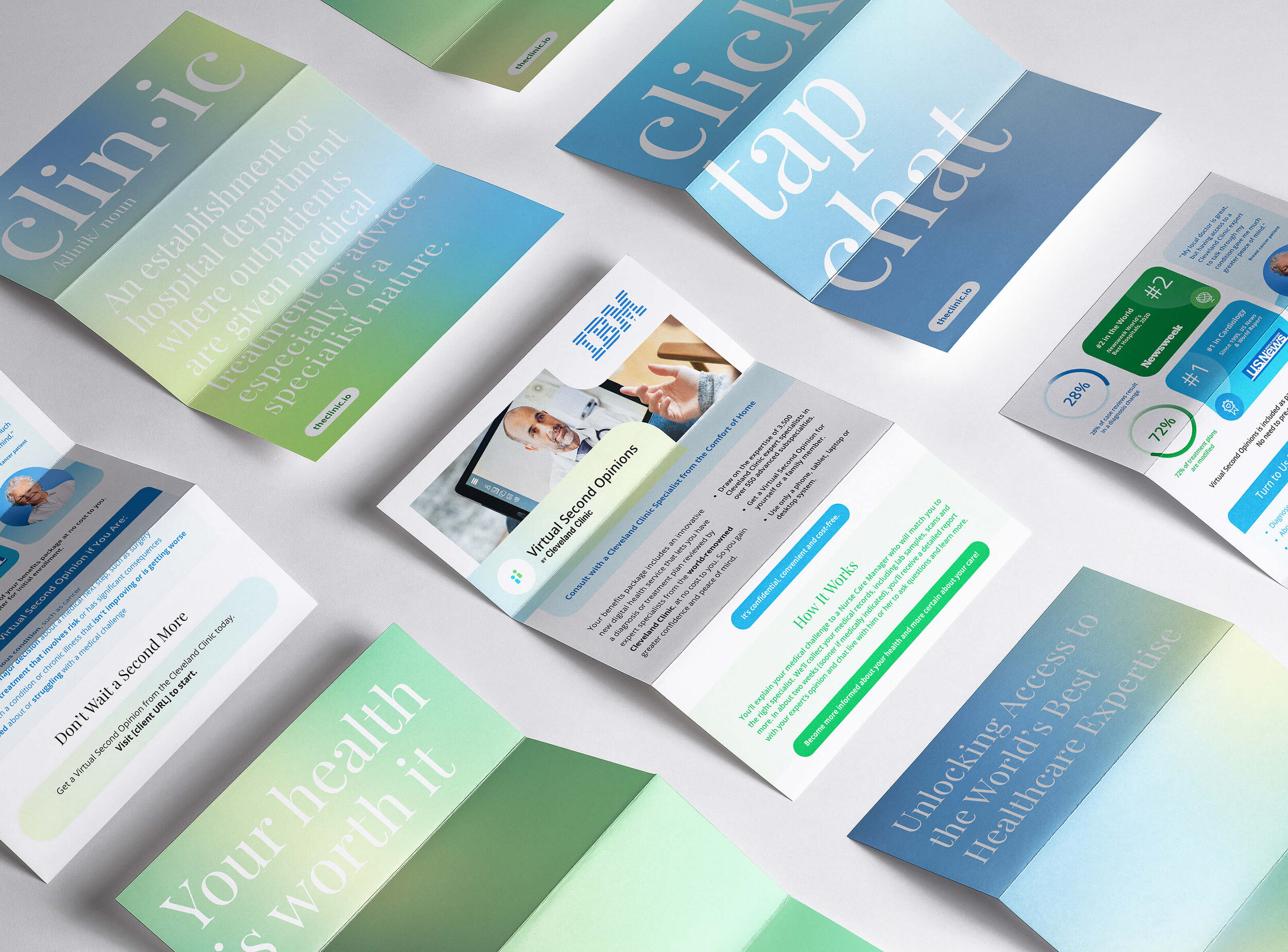
Fresh/and to the Point. When developing the website, it was critical to make sure content was succinct and to the point, speaking to the Clinic’s quality and cutting edge technology—while also expressing newness, comfort and accessibility. Our answer was a visual system that utilized soft, flat color fields, smooth gradients, a consistent iconographic family, positive imagery, and a narrative ‘voice’ displayed by large, confident typography. Both rounded and hard edges also convey likeness to the core elements of the brand.
An App concept proposal, shaping the doctor-patient telehealth experience.
Intentionally coherent style. Below is a closer look at the range of content styles made for all print and digital applications. Patient testimonials, statistics, section highlights, callouts and quotes were carefully considered elements shaped by our design strategy and visual system; made intentionally bright, approachable, and distinctly The Clinic.


